Client: Web Studios UK.
Project: Studio Momentum Logo Identity
Design Brief:
Studio Momentum is a new start up product/service belonging to Web Studios UK, and in need of an identity to start the new business project. The Studio needed a Logo Identity which describes the business as Creative, Technical, Sophisticated, Contemporary, Dynamic and magical. The final logo has to work both in full colour and also solo black and white, to make it more versatile to implement across all mediums of the business. The logo has to be iconic where it can stand alone, such as used or watermarking the company’s creative images. The icon should also be simple and effective enough to be transferred onto promotional materials.
Initial Concept Sketching:
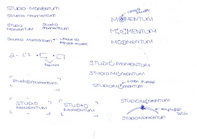
This part of the project I create pages initial sketched concepts at its simpliest form and shape to explore different variations and pathways to further develop.
 |
| Brainstorming Imagery, Words, Colours to help aid my sketches in the idea sketching process |
Finding the Font:
Before creating my digitally rendered mock-up concepts chosen from my initial sketches, I explore a variety of fonts and select the font which suits the look and feel of the company name the best. In this case i was looking for a modernistic clean sans-serif font with geometric curves. I settled for Eurostile.
 |
| List of the company name written in variation of fonts |
Initial Concept Development:
Taking the 3 best concepts from my initial sketches, I digitially rendered those 3 sketches into mock-ups to present to the client. The chosen concept will then be taken into further development in the refinement stage.
Chosen Concept Development Stage:
 |
| Developing the concept by looking at composition variations |
 |
| Exploring different colours |
 |
| Final Logo and Stationary |
Evaluation:
The concept behind the Logo is an iconic camera shutter and a gold star reflecting flash/capture to illustrate the business activity of being a Photography service. This creates a very iconic logo as it becomes obvious at first glance of the nature of the business even without displaying the name. This supports the need for an iconic Logo which can stand alone.
The gold star in the lens reflects how the company intends to capture moments. The dynamic shutter illustrates the need to reflect the company as dynamic and technical.
The use of a very modernistic font with good geometric curves and lines helps to fit in with the icon. The font has the same shape and form relating to the icon, creating a healthy balance.
The use of black and gold/yellow work well to compliment a eye catching feel, Creating a look of sophistication, elegant, clean and also fun and magical. The colours compliment well together.
Tagline:
“a captured moment is a moment captured” is the creative slogan. The use of wordplay makes the slogan memorable. To break it down:
“a captured moment” – A photograph of a moment taken at the present time.
“Is a moment captured” – that moment is captured forever.
Also the words in the slogan “moment” and “captured” are written in bold so it also reads “moment captured” to emphasize on the meaning of a “moment captured” forever.


I want some more information about Logo Design for my IT company. Also I have some more information about Unique Logo Design,
ReplyDeleteThank You. logo designs